Optimizing for Core Web Vitals: Top 10 Pain Points and How We Solved Them for Our Clients
It is a truth universally acknowledged by SEOs and marketers that when Google announces a new ranking signal, it is an extremely big deal.
Well, it happened in May when Google announced its next official Google ranking factor – Core Web Vitals.
Since then, many of our clients (and some new ones) called us to learn more about what this ranking signal means, what they can do to diagnose their website and how they can prepare for it.
This is why I decided to write this article and share my experience so far.
Last week I performed a lot of tests (I diagnosed more than 30 websites in just a few days) and what I found was quite disturbing.
95% of the websites didn’t pass the Core Web Vitals assessment by Google, especially for mobile. Their mobile score ranged from 3 to 11 points out of 100.
Mobile accounts for approximately half of web traffic worldwide. In 2020, mobile devices (excluding tablets) generated 51.53 percent of global website traffic.
Apparently, it’s no longer enough to provide a good user experience for just half of your visitors.
In the conversations, I had last week, website owners explained to me that optimizing for Core Web Vitals isn’t in their priority list. They do not consider it important.
Allow me to disagree.
Core Web Vitals are more about user experience and less about ranking in Google.
User experience is what makes the difference between someone becoming a loyal user or them leaving and never coming back.
Google’s studies show that for pages that meet the thresholds of Core Web Vitals, visitors are 24% less likely to abandon the site. So even without Core Web Vitals being an official Google ranking factor, it can still be important because it provides a better user experience.
Just think of it: Twenty-four percent is like gaining 24% more traffic without doing anything, simply by making your site a little more usable. 24% more visitors would stay on your website and consider buying your services and products.
What are Core Web Vitals and what do they measure?
In plain words, Core Web Vitals are real-world experience metrics that measure the actual user experience. These signals include loading performance, interactivity, and visual stability of the page.
So basically, when visitors are using your web page on a mobile or a desktop device, what’s that experience like in terms of speed, interaction, and things like that.
Core Web Vitals consist of three main signals:
- Largest Contentful Paint (LCP),
- First Input Delay (FID)
- Cumulative Layout Shift (CLS).
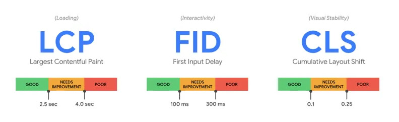
1. Largest contentful paint (LCP)
LCP measures loading performance. It answers the question how fast does the page load?
That’s what Google is looking at. The largest piece of content above the fold, whether it be an image, video or text, how fast does that take to load on mobile or/and desktop.
What is a good LCP score?
To provide a good user experience, sites should strive to display the most important content within 2.5 seconds of when the page first starts loading.
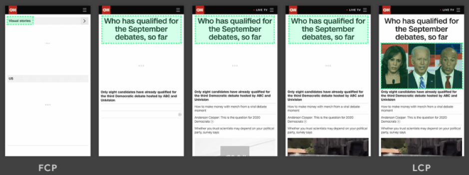
We all agree that it’s more pleasant to have content that displays directly – no one likes to see blank pages.
A web page is displayed in stages. So the “largest element” might change during page load. From the example below you can see highlighted in green what is considered “largest element” during the page load. So, the faster the image loads, the better LCP you will get. That’s it!
The most common causes of a poor LCP are:
- Slow server response times
- Render-blocking JavaScript and CSS
- Slow resource load times
- Client-side rendering
2. Cumulative layout shift (CLS)
Well, I am sure we’ve all had that experience when we have been reading an article online and something suddenly changes on the page. Without warning, the text moves, and you’ve lost your place. Or even worse: you’re about to click a button or a link, but in the instant before your finger taps, the link moves and you end up clicking something else.
This is happening way too often. And you must admit, it is very annoying.
That’s poor user experience. So that’s what Google is measuring with cumulative layout shift (CLS).
The number one reason that things aren’t stable is that image sizes often aren’t defined. So if you have an image with 400 pixels width and height, those dimensions need to be defined in the HTML. There are other reasons as well, such as animations, banners and things like that.
What is a good CLS score?
To provide good user experience, sites should strive to have a CLS score of less than 0.1.
3. First input delay (FID)
The First Input Delay (FID) measures the “responsiveness” or interactivity of a page. It measures the time from when a user first interacts with your page (i.e., when they click on a link or button) to the time when the browser is actually able to respond to that interaction and produce a result.
It answers the question, how fast is the page interactive?
It’s not a good experience when you click on something and nothing happens or it’s very slow. So that’s what that’s measuring.
The FID can be seen as a measure of user frustration. Indeed, there is nothing more frustrating than clicking a button that takes seconds to trigger the next step.
What is a good FID score?
To provide a good user experience, sites should strive to have a First Input Delay of less than 100 milliseconds.
The most common causes of a poor FID are issues in your JavaScript or third-party code, and there are different ways to dig in and fix those.
Related: eCommerce Cost Calculator – find out how much your ecommerce website will cost in 2020
How to measure page experience and Core Web Vitals
For site owners wanting to gauge how their websites measure up to the new ranking signal, Google has updated its Lighthouse and PageSpeed Insights tools to surface information and recommendations about Core Web Vitals.
Google Search Console now also provides a dedicated report to help site owners identify areas for improvement.
To get started with optimizing for Page Experience in the second half of 2020, Google recommends following these steps:
Step 1 – Start from Google Search Console
Go to Google Search Console and open the “Core Web Vitals” report to identify pages that need special attention.
Step 2 – Analyzing pages with PageSpeed Insights
PageSpeed Insights will give you a report with suggestions for improvement.
Step 3 – More data with Lighthouse
Now run the test with Lighthouse. You will see that Lighthouse and PageSpeed Insight display similar improvement opportunities, but in Lighthouse, you will find additional information.
Step 4 – Prioritize with web.dev
You can also start the audit of your page via web.dev/measure. Very useful tool that will give you an overview of the elements in order of priority.
Step 5 – Resolve the problems of your site
As a result of this initial analysis, you have now identified many issues that need to be addressed.
Each website has its own problems. Let’s try to study the most common ones and also to define the best practices for optimizing a website.
Tips and best practices for the performance optimization of your website
Let’s focus on what’s really important. If you have issues, how do you fix them?
Now I’m going to be honest with you. Most of these can get pretty technical. You may need a web agency like AirDesigns that is an expert in page speed and performance and can comfortably address these problems.
When optimizing our clients’ websites in the past couple of months, we faced some common pain points that we solved to improve their user experience:
Images are not optimized
Image optimization is an art that you want to master. Images are the cornerstone of every online presence and they must be optimized in order to reduce site loading time
Optimizing web images is a process of delivering high-quality images in the right format, dimension, size, and resolution while keeping the smallest possible size.
Image optimization can be done in different ways. You can manually reduce the size of every image by using one of the following services:
- TinyPNG – https://tinypng.com/
- Imagify – https://imagify.io/
Or, you can use one of he following tools which optimizes images using an intelligent compression algorithm:
- Imgix – https://www.imgix.com/
- Optimole – https://optimole.com/
Tips:
- Compress your images
- Replace Animated GIFs with videos
- Use new generation image formats such as WebP or JPEG 2000. Keep in mind that these formats are not yet supported by all browsers, so you will need to have fallbacks
Missing lazy loading
Lazy loading is the practice of delaying load or initialization of resources until they’re actually needed. These improve performance and conserve bandwidth by delivering content to users only if it’s requested.
For instance, if a web page has an image that the user has to scroll down to see, you can display a placeholder and lazy load the full image only when the user arrives to its location.
There are several open source libraries that can be used to implement lazy loading, including:
- blazy.js – blazy.js is a lightweight JavaScript library for lazy loading and multi-serving images, iframes, video, and other resources.
- LazyLoad – LazyLoad is a script that automatically loads images as they enter the viewport.
Important – make sure you don`t lazy load images above the fold because this will directly influence your LCP
Inline SVG icons instead of icon fonts
In the world of modern web, icons have become an integral part of UI design. Consequently, every developer has to face this conundrum – Which icon set should they use?
When it comes to file sizes icon fonts have a slight edge over SVGs. Your file size can be considerably larger if you are using Inline SVG over external SVG icon file. One major reason for this is the fact that unlike external SVG, Inline SVG is not cached by the browser. However, by in-lining your icons you make sure to load only the icons needed on the page the user is on instead of the full library.
Tips:
- Remember to optimize your SVG resources before including them in the code. Here is a great tool – https://jakearchibald.github.io/svgomg/
- When you use inline images (both jpg/png and svg), you might have to convert them to base64. You can do it with a free tool like: https://b64.io/
Alternative – if you are not a fan of SVGs and want to stick to web fonts for your icons, consider compiling a custom web font with only the icons you use. This way the size of the web font will be greatly reduced. You can create your own web fonts with icons with tools like – fontello.com
Not using different image sizes for the different screens/devices
A great practice that I haven’t seen a lot of developers take advantage of is creating variations of the same image (responsive images) and indicate them in the HTML code. This way, depending on the screen size, the right image at the right size will be displayed.
You can learn more in this great guide to the responsive images syntax in HTML.
Not optimizing your website resources
While optimizing our clients’ website, we noticed that in most cases the used libraries are loaded on all pages of the website. That significantly slows the loading speed.
Tips:
- Load your resources/libraries only where/when needed in order to reduce the number of requests, size and loading time
- Aggregate your resources into a single (or a couple of) files
- Remove all the code in the CSS and JS files that is not used. Usually, older sites have a JS file that might reach 1 MB in size which is not acceptable.
- Here is an open-source tool that can help you find unused code – https://github.com/purifycss/purifycss
- If you are looking for out-of-the-box solution you can check out this service https://unused-css.com/
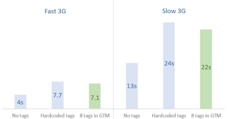
Using too many external services
Many websites are using too many external services or use external services with poor optimization like live chats, measuring pixels, tracking tools like HotJar, social sharing tools, etc.
While those tools are really helpful, some of them might make your website loading really slow. For example, if your live chat service takes 2 seconds to load, it adds 2s to each page view.
Tips:
- Load all those tools via the Google tag manager (GTM). Tests suggest that in terms of performance loading tracking tools via GTM have a slight performance increase compared to hardcoding them in your code. Keep in mind that this is not a solution since those tools will still affect you page speed, so review all tools you use and only keep the ones that are essential.
Render-blocking resources not eliminated
We rarely see critical CSS implemented and differ the rest of the CSS and the JS. Scripts and stylesheets are both render blocking resources which delay FCP, and consequently LCP.
In the ideal situation, you should have the CSS that is needed for styling the page above the fold loaded as inline in the header of the page (this is the so-called Critical CSS), and the rest of the resources can be executed later with the attribute async or defer.
How to identify these resources? Use the Chrome DevTools from the Coverage tab. It tells you which resources are executed during the initialization of your page, and which are just loaded.
Tips
- Defer any non-critical JavaScript and CSS to speed up loading of the main content of your web page.
- Ensure that only the minimal amount of necessary CSS is blocking render on your site with the following: minify CSS; defer non-critical CSS, inline critical CSS
- Reduce JavaScript blocking time – download and serve the minimal amount of necessary JavaScript to users. Reducing the amount of blocking JavaScript results in a faster render, and consequently a better LCP.
Keeping unused/useless CSS and JS
CSS and JS can be minified, i.e. remove all comments, remove extra white space, displayed on one line and therefore took up less space. It is a relatively simple operation and can be done with an online tool.
Used too many web fonts
Custom web fonts are used everywhere around the world (67% of web pages now use custom fonts), but many (oh so many) sites load them improperly. This causes a lot of problems for page loading like performance issues, slow loading time, blocked rendering and swapped fonts during navigation.
There are just four steps to consider when loading a custom web font:
- Use the correct font format
- Preload fonts
- Use the correct font-face declaration
- Avoid invisible text during font loading.
If you are wondering exactly how many fonts is too many, the general rule of thumb is that three’s a crowd and it’s best to stick with two – one for your headings and one for body copy.
Tips:
- Make sure you are not loading a new font just for a single sentence.
- Self-host your fonts – this is a point that can be argued about considering the benefits of using Google CDN to load your fonts, but in our experience even those servers sometimes are slow to respond.
Think of it: if your page load is excellent, but the Google CDN takes a second and a half to serve the font, the end result will be a slow page load. Having all fonts loaded locally eliminates this risk.
Server setup issues
The server where your website is hosted plays a huge role in success of a website. The longer it takes a browser to receive content from the server, the longer it takes to render anything on the screen. A faster server response time directly improves every single page-load metric, including LCP.
What the most common server-side issues are:
- Hosting – your server should be powerful enough to handle your traffic and resources. Shared hosting plans are unreliable and there is nothing that can be done in terms of performance optimization if your website is hosted on a shared server.
- Server location – The idea of the World Wide Web would suggest that you can host your website anywhere in the world, but this is not quite the case. Pick a server location that is close to your main audience.
- Not running the latest PHP version (or any other framework)
- Missing gzip on the server
- Expiry headers not being set
Next step is to improve how and where your server handles your content. Use Time to First Byte (TTFB) to measure your server response times. Then, you can improve your TTFB in a number of different ways:
- Optimize your server
- Route users to a nearby CDN
- Cache assets
- Serve HTML pages cache-first
- Establish third-party connections early
Conclusion
Between the need to keep abreast of shifting web trends, the changes to consumer habits and behaviors, and the upcoming changes to Google’s rankings, it’s the best time to look into your website performance metric and improve user experience.
While the immediate future is still highly unpredictable in regards to the uncertain times we live, web performance forms the basis of where I believe businesses should be focusing their efforts in order to take advantage of the opportunities, and ride out the challenges, of the next months. Shrink budgets need to be allocated in the right direction to achieve higher ROI.
User experience never fails you.
Want to get ready for the Core Web Vitals Update?
We are experts at delivering technical audits with actionable recommendations. We can help guide you through the process and assist with implementation.
Request a free consultation or Schedule a call

Valentin Dzhebarov
Managing Partner
Have a question?
Contact our technical guy Valentin if you want to know more. He'll be happy to help you!
Contact Valentin